Foundation’s Logo

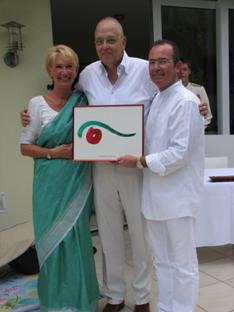
Handover of the Logo to the Söllhuber Stiftung
From left to right Angelika Söllhuber,
Ulrich Willert, Dr. Andrés Söllhuber
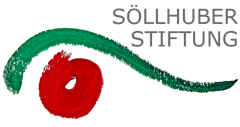
The Logo was produced in Chinese ink painting, based on the colours of Bangladesh’s flag.
The red ball in the middle symbolises the inflammation, the disease, in the end the cataract. The ball bears a centrifugal force as demanding the sick lens to be removed and substituted by a new one with the aim to get light projected on the macula (light-perceptive cells) again. The white spot in the middle in conjunction with the dynamic iris (ball) reflects the sight recovery process.
In order for an eye to be noticed it needs an eyebrow or eyelashes. Moreover, the beguiling green eyebrow stands symbolically for the protection of the eye and as a metaphor for the protection of the child.
The designer of the Logo is our in 2013 deceased friend, Ulrich Willert.
